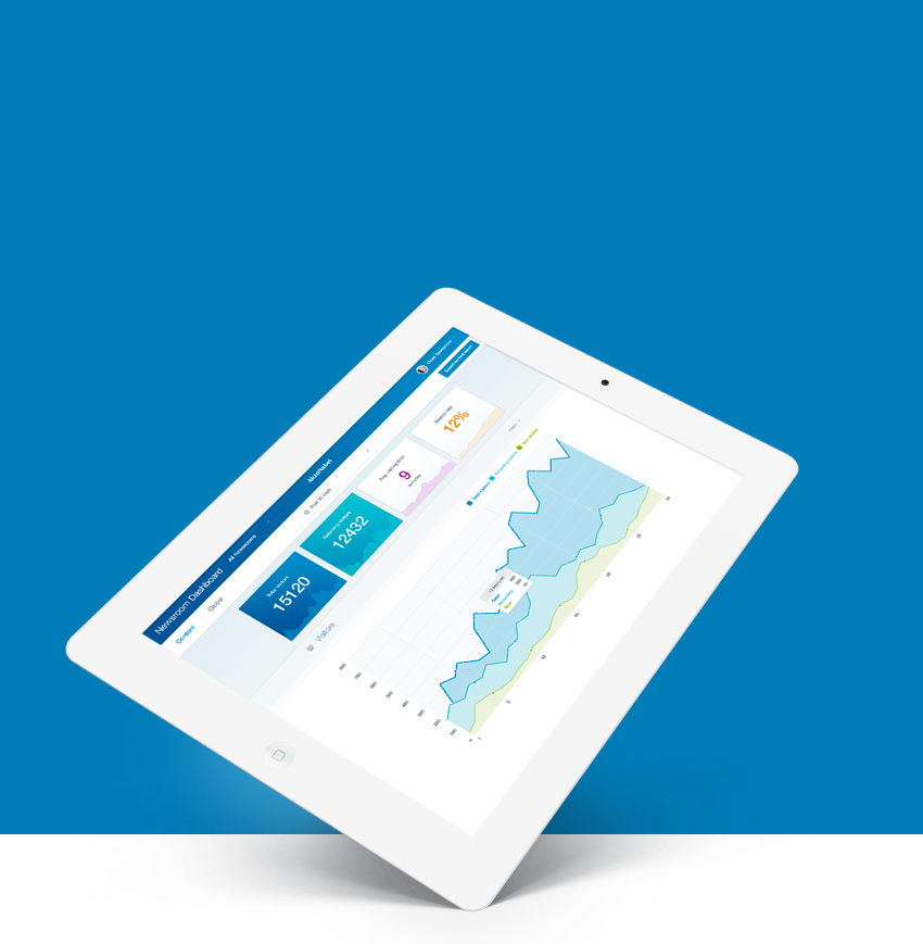
Code of Conduct
AkzoNobel
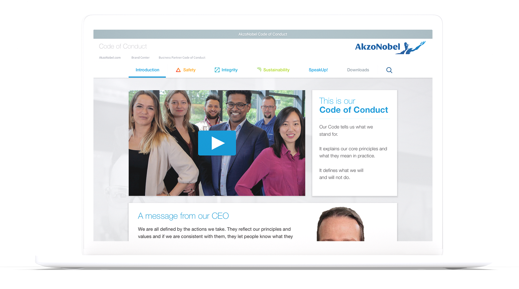
Akzo Nobel's core principles named Code of Conduct, wrapped in a responsive website.
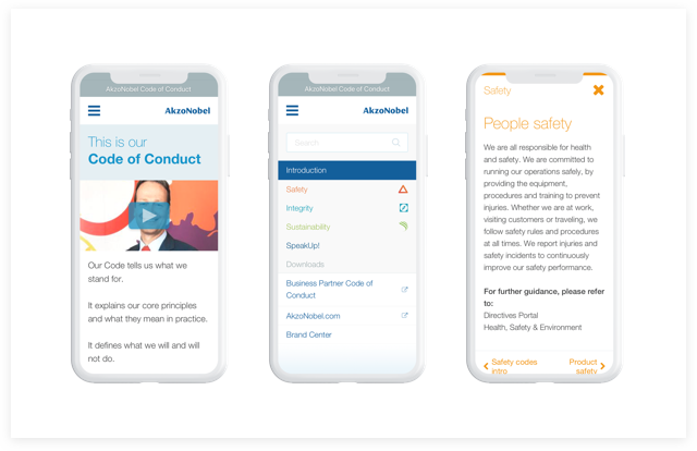
Different device,
same experience
To enclose the same amount of content on all devices, demands being creative with your real estate. 3 breakpoints make the design fluid . Animations and transitions were prototyped in Framer and shown to the costumer before development.
Corporate identity
Just like the other Akzo Nobel projects, operating within the boundaries of Akzo's corporate identity is key. As a passionate UI designer I see this as a challenge!


Selected Works
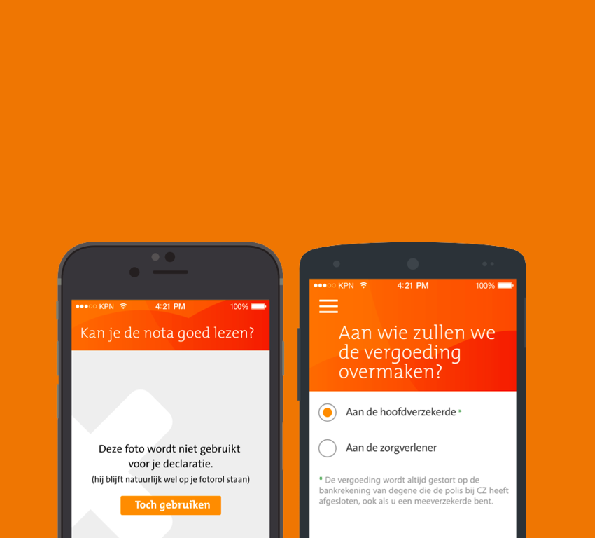
Declaratie app - CZ ZorgverzekeringenProject type

Pīntú Puzzel - WebshopWebshop

Shell - Ease the check-outService Design
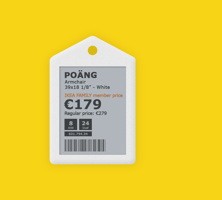
Digital Labels - IkeaProject type
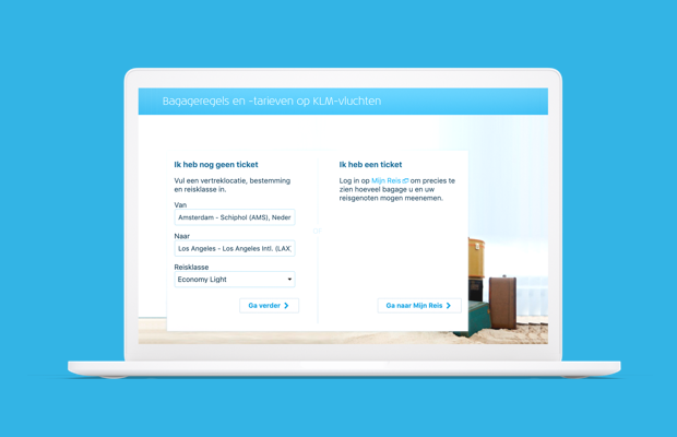
Bagage Calculator - KLM Royal Dutch AirlinesProject type

Nespresso redesign - Way of workingProject type
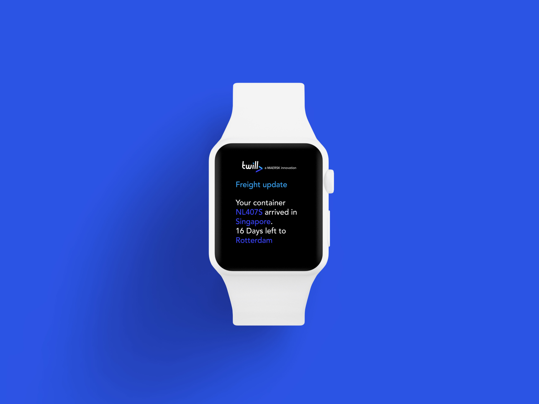
Twill redesign - TwillProject type
Code of Conduct - Akzo NobelProject type

App redesign - ExcelliorProject type