Twill redesign
Twill
Redesigning the Twill.net website, generating more subscriptions to their SaaS solution
The case
Twill.net is a start-up backed by Danish freight logistic company Maersk. Since transporting cargo is a tidious job regarding the different regulations in each country, Twill launched a SaaS solution which handles all the necessary paperwork. Their target is to provide logistics to small and medium sized businesses with their easy to use software. Only thing, how can we generate more subscriptions with the website? Let me take you through my (re)design decissions, step by step.
.
Get into the feeling
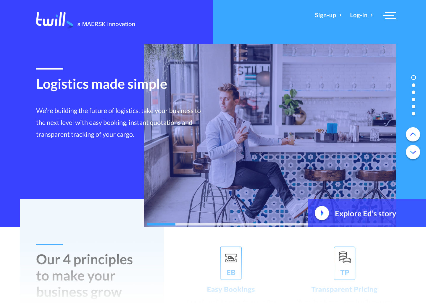
First of all, make the visitor feel welcome. You're in the right place! Short and snappy video (max 1 min) will play automaticly in the background. Blue colors are derived from their existing logo. Layered distribution of elements gives the design depth. You get seduced above the fold to scroll downwards towards the next section.
Header
The solution needs to be user centered, so thorough research is a must. After 3 days of intense field research, shadowing employees and interviewing them, we’ve mapped all internal proccesses and bottlenecks creating a holistic view on the matter.
Twill's unique selling points
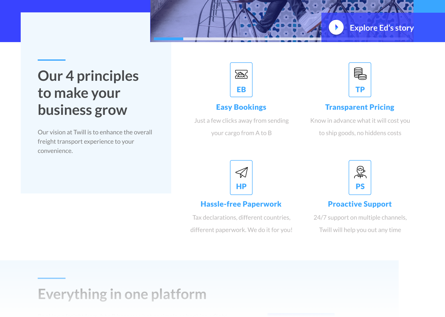
Twill mentioned that their 4 principles are in fact their mantra. So I created easy to scan overview, knowing that icons in combination with copy is the best way to stay top of mind with the customer. Click on an icon and a pop-up with a brief (video) explanation will appear (check the demo).
Unique selling points
In order to gain traction within a company working together with the client is key. So we facilitated design thinking sessions in co-creation with IKEA generating awesome out of the box ideas. We picked out two of those ideas and converted them into a proof of concept wit a strong business case.
Show them how easy
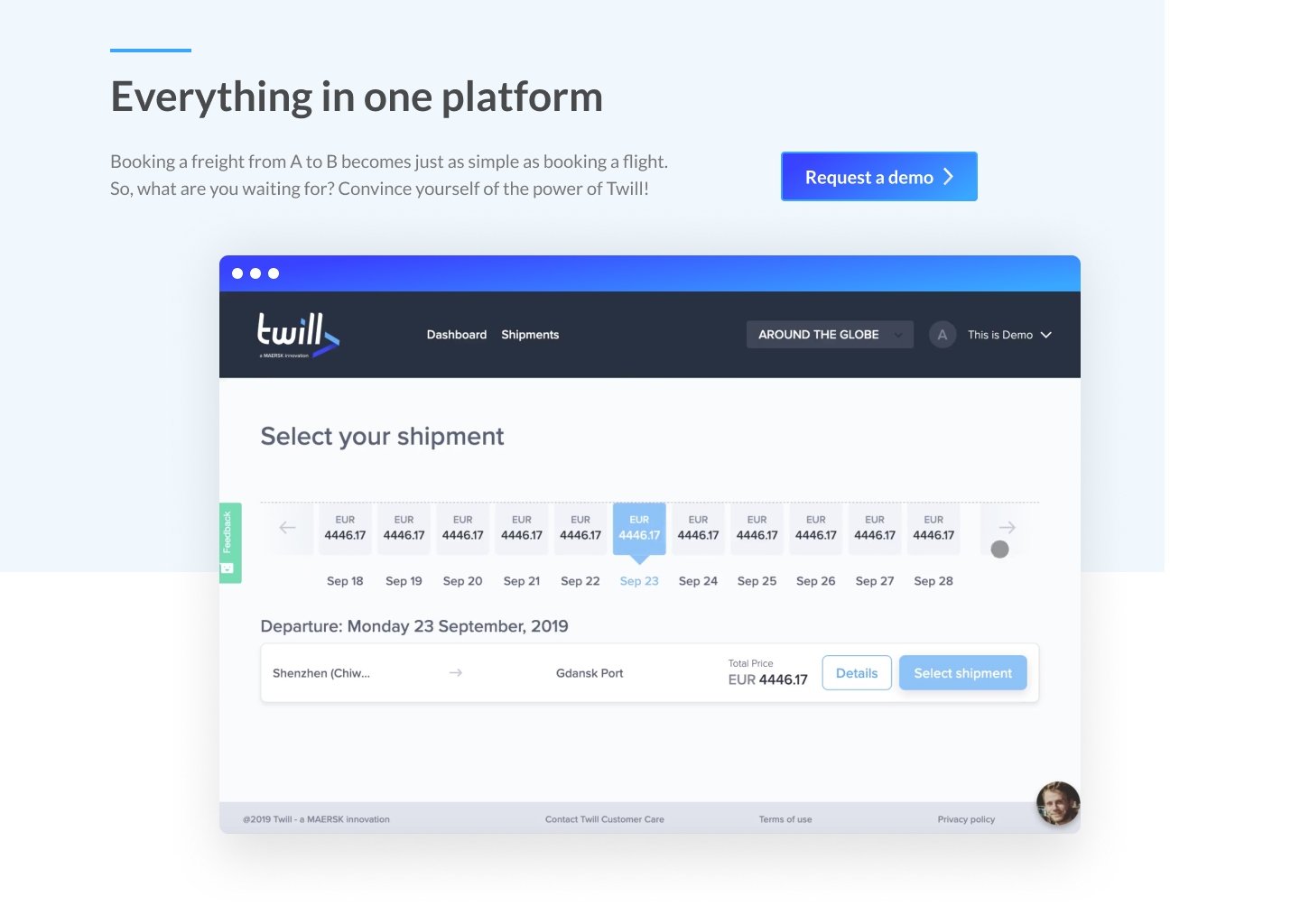
So, Twill told me that booking your freight is just as easy as booking a flight ticket (...well almost). Well, show them through a video or animation. And once again not longer than a minute or so, we don't want to bounce visitors with dreadful long video's.
If convinced, here is your first call to action to request a demo.
Live demo
The solution needs to be user centered, so thorough research is a must. After 3 days of intense field research, shadowing employees and interviewing them, we’ve mapped all internal proccesses and bottlenecks creating a holistic view on the matter.
The kill
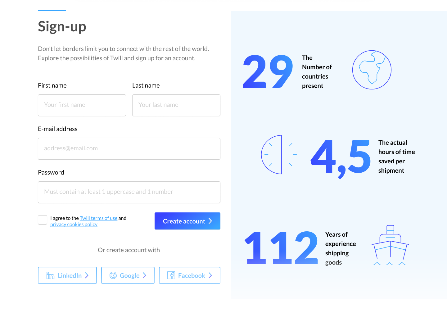
Sign-ups are deadly. If confronted with too many input fields or a failing user experience the visitor will eventually go away. So I only ask for the minimal amount of credentials to create a working account. You can fill in the details later on. Ofcourse you can sign-up with the known social media as well to make it easy. And while we're at it, display some facts and figures about the (mother) company to gain trust.
Sign-up
In order to gain traction within a company working together with the client is key. So we facilitated design thinking sessions in co-creation with IKEA generating awesome out of the box ideas. We picked out two of those ideas and converted them into a proof of concept wit a strong business case.
Other users
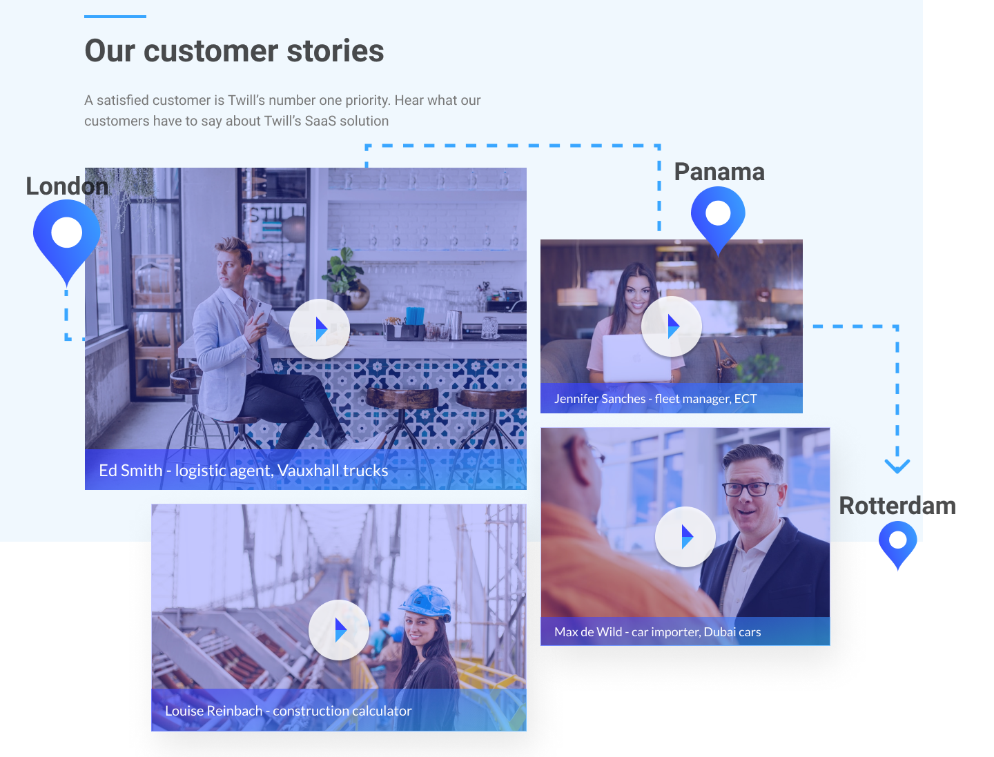
We already started with this in the header of the page, but I guess you recognise yourself in it when buying something online.. Look for reviews and experiences from other users, nothing more convincing than that. I tried to make it international by showing customers from different nationalities. Video's will enlarge themselves into a pop-up player, not surfing away from the landingspage.
Other users
The solution needs to be user centered, so thorough research is a must. After 3 days of intense field research, shadowing employees and interviewing them, we’ve mapped all internal proccesses and bottlenecks creating a holistic view on the matter.
Jennifer the chatbot
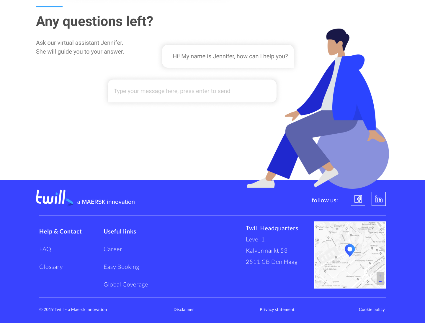
For all those who have questions left, here is Jennifer the AI chatbot. The more intelligent, the better. Of course you could implement a FAQ in the first stage, replacing it by a chatbot in a later iteration.
Chatbot
In order to gain traction within a company working together with the client is key. So we facilitated design thinking sessions in co-creation with IKEA generating awesome out of the box ideas. We picked out two of those ideas and converted them into a proof of concept wit a strong business case.
Curious about this desktop version? Check out the clickable demo which I presented to the client.
.
Mobile
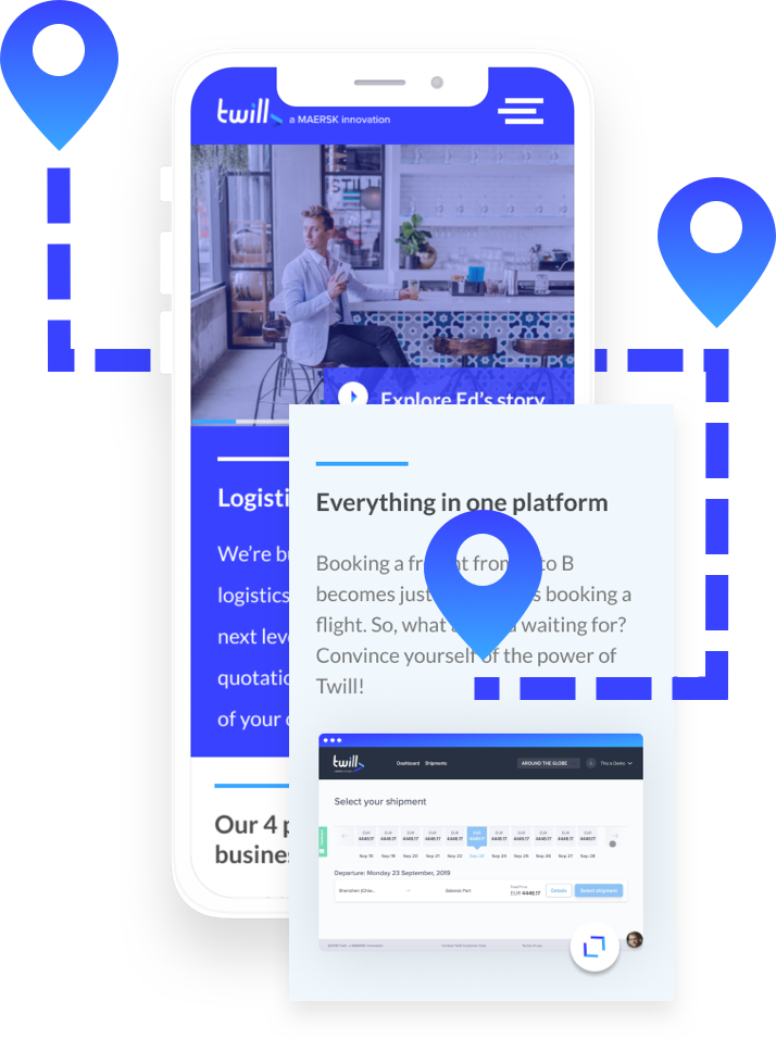
Where would you be without a mobile version of your website. So, I made a responsive version, keeping in mind the readability of the text, content first priciple and placement of the buttons. Check the demo by clicking the image.
Chatbot
In order to gain traction within a company working together with the client is key. So we facilitated design thinking sessions in co-creation with IKEA generating awesome out of the box ideas. We picked out two of those ideas and converted them into a proof of concept wit a strong business case.

Wearable
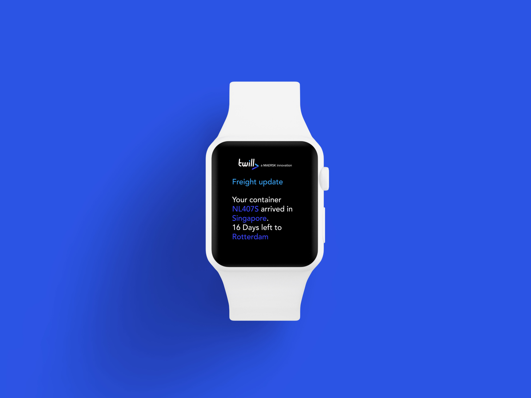
When designing I empathize with the end user and forsee their problems. As a small company I would like to keep in touch with my precious cargo. So why not get your updates and tracking through your wearable whenever you want.
Chatbot
In order to gain traction within a company working together with the client is key. So we facilitated design thinking sessions in co-creation with IKEA generating awesome out of the box ideas. We picked out two of those ideas and converted them into a proof of concept wit a strong business case.
Selected Works
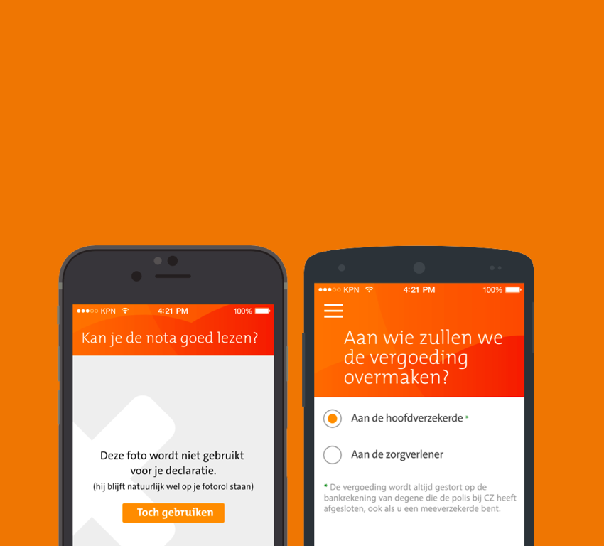
Declaratie app - CZ ZorgverzekeringenProject type
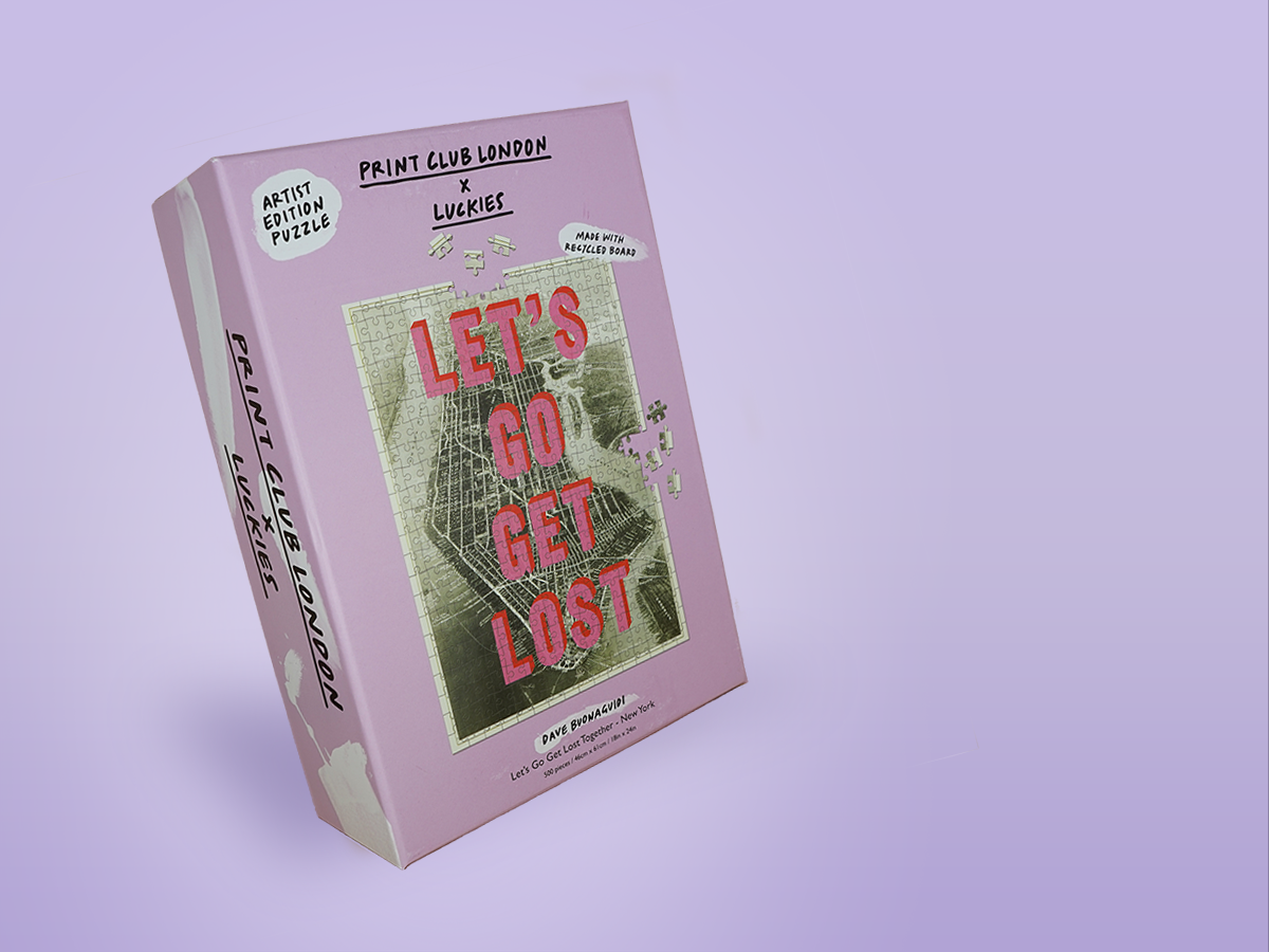
Pīntú Puzzel - WebshopWebshop
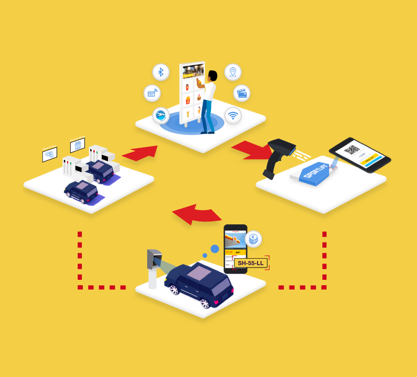
Shell - Ease the check-outService Design
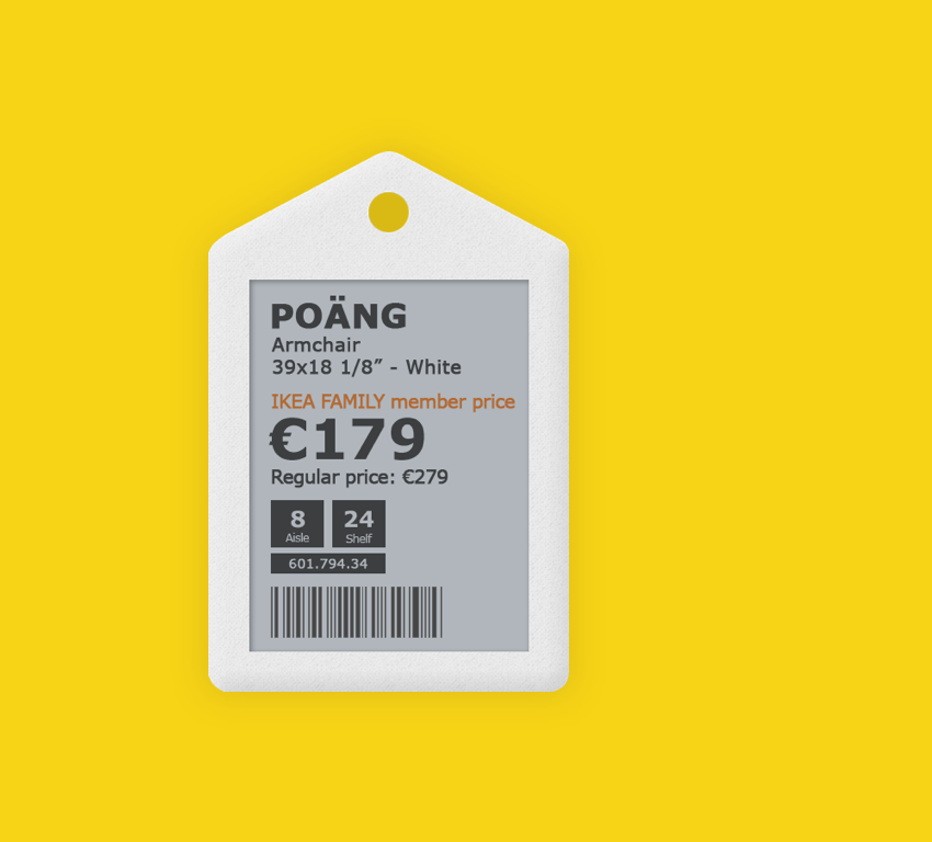
Digital Labels - IkeaProject type
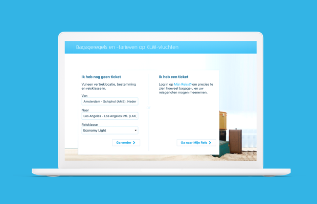
Bagage Calculator - KLM Royal Dutch AirlinesProject type
Nespresso redesign - Way of workingProject type

Twill redesign - TwillProject type
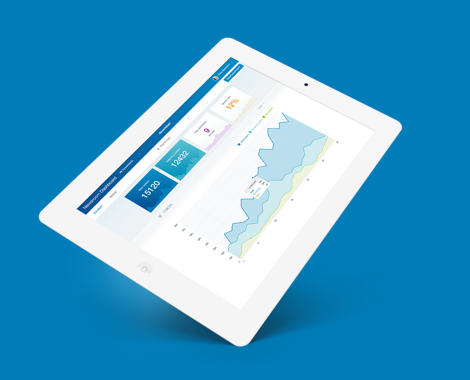
Code of Conduct - Akzo NobelProject type
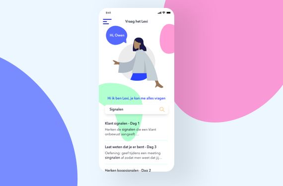
App redesign - ExcelliorProject type
